Otto Ottobre
Branding / Web design / Web development

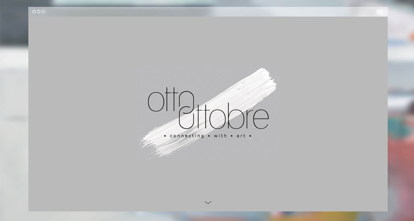
OTTOOTTOBRE
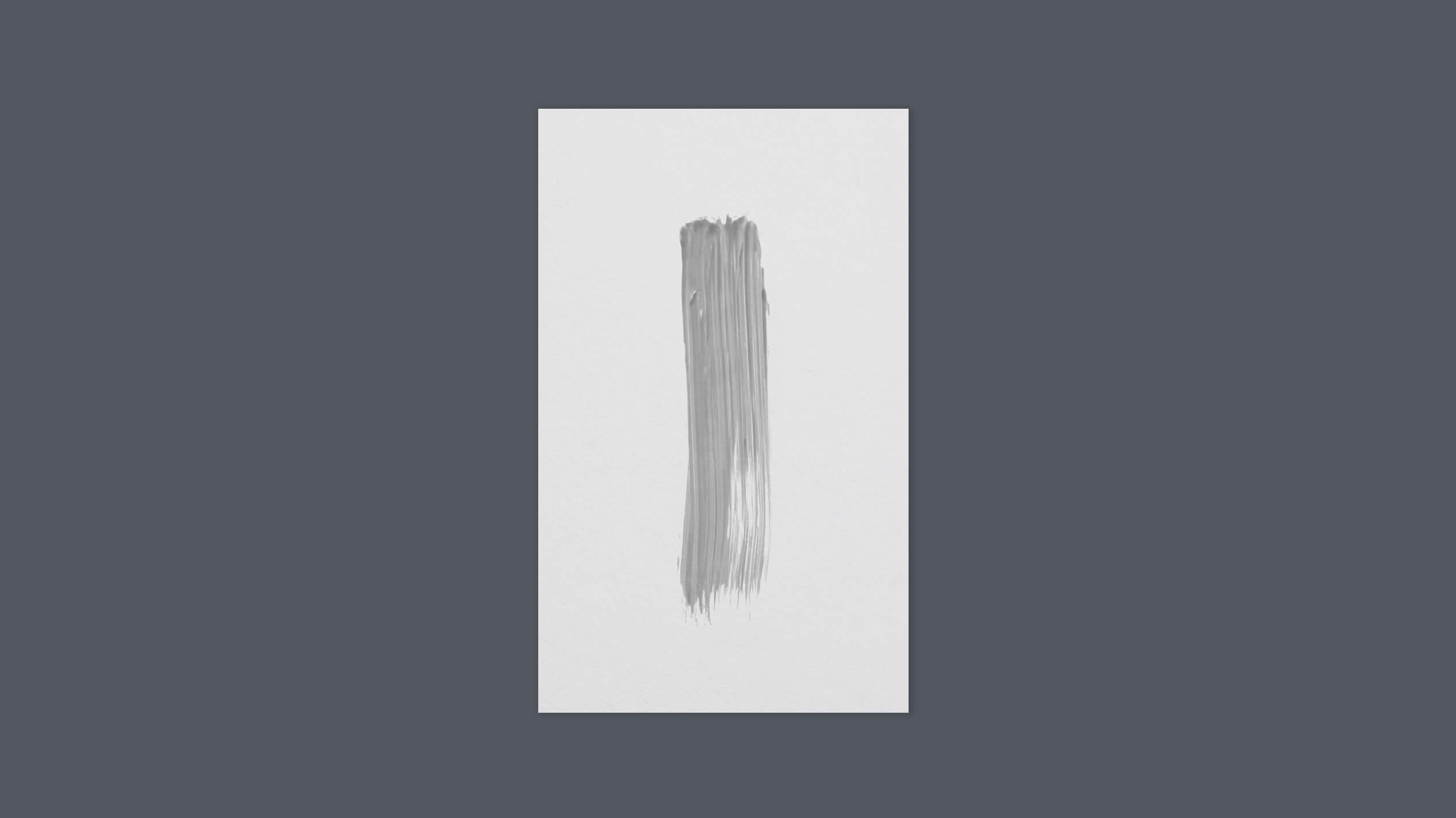
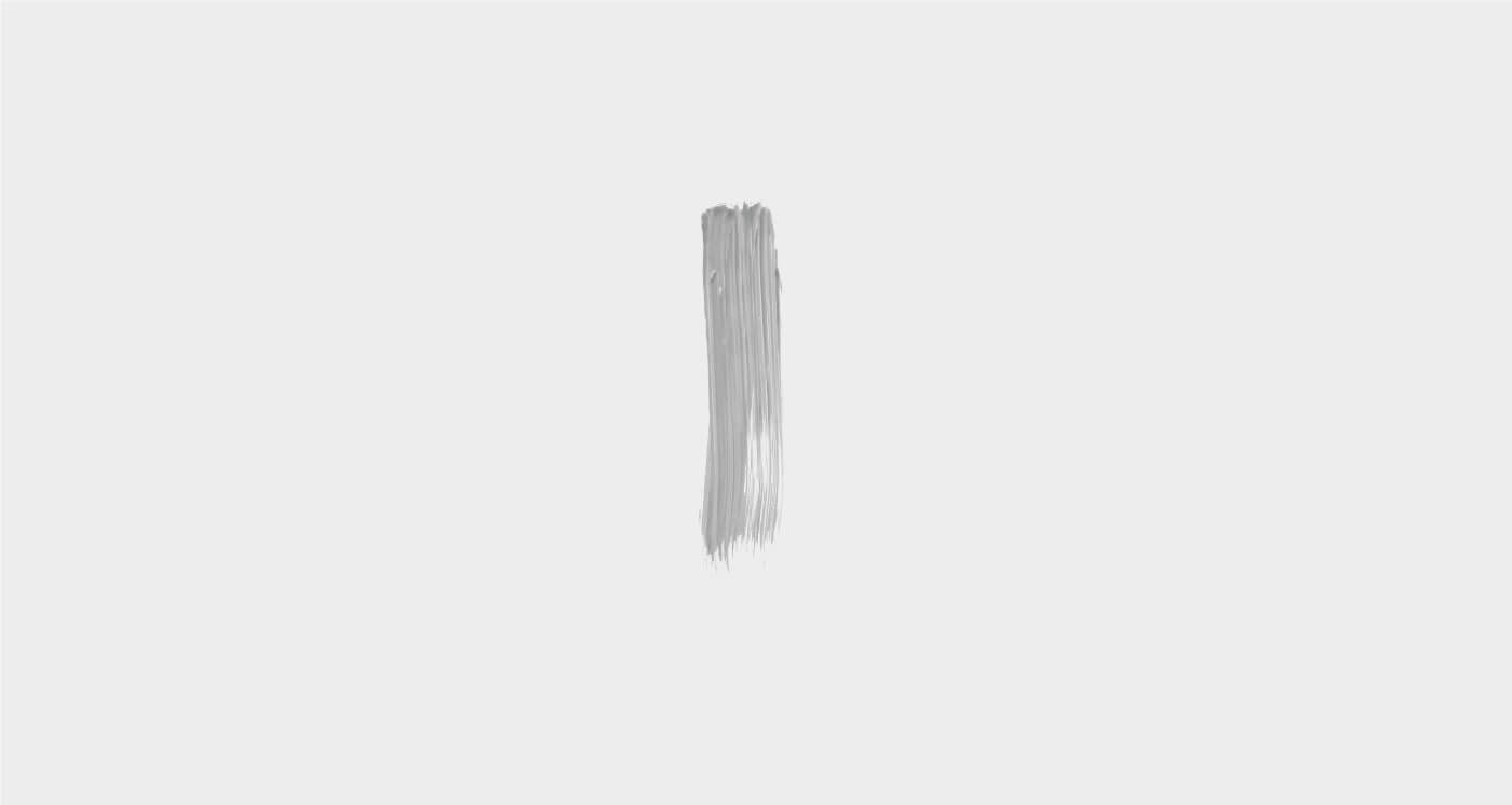
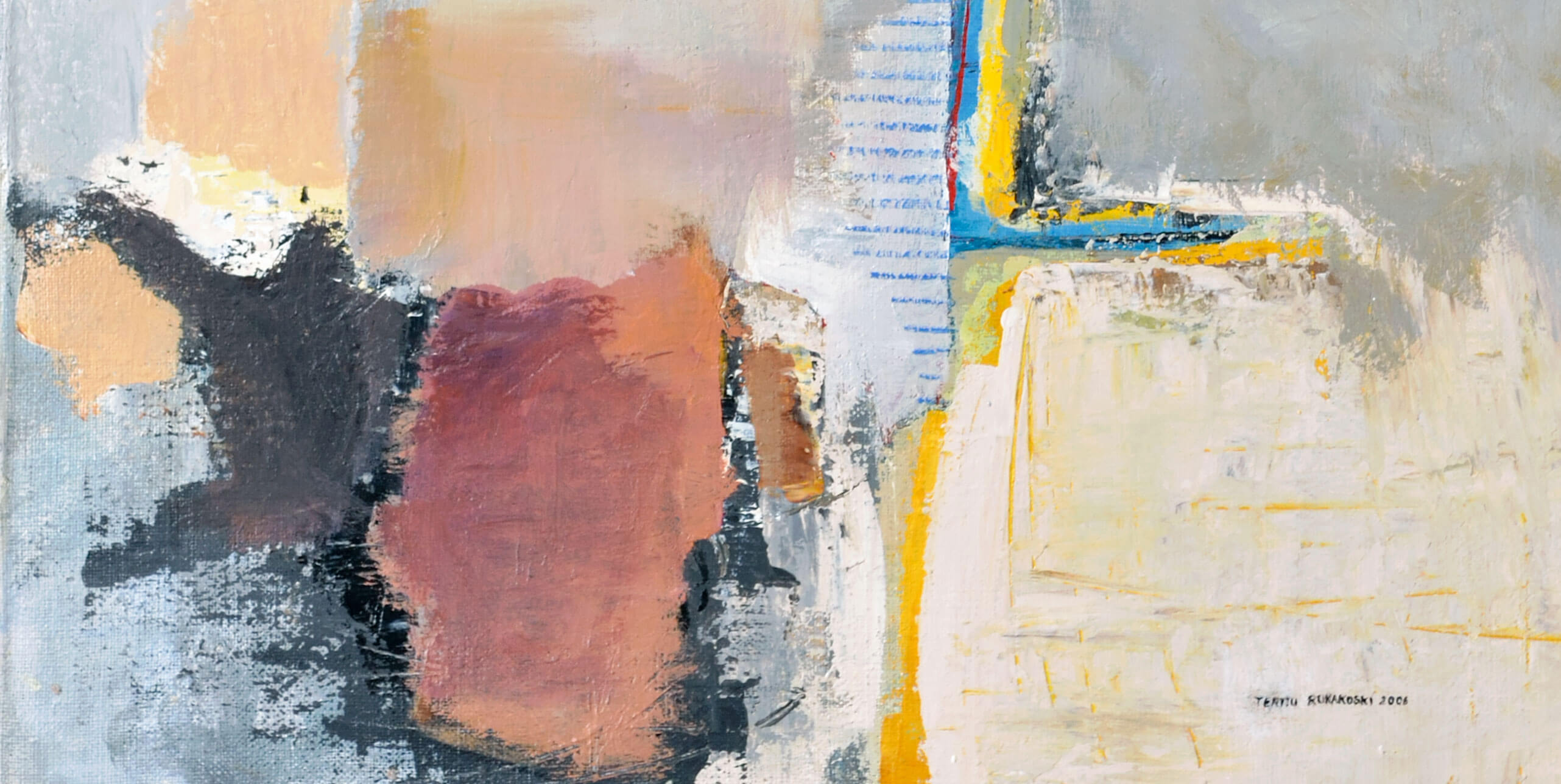
THE BRUSH STROKE CONCEPT
Ottoottobre is a London based art group with a fresh eye for new artists. I've been working closely with these guys and came up with an effective branding solution. The brush stroke is the means to achieve an artistic expression and it deserves the leading role.
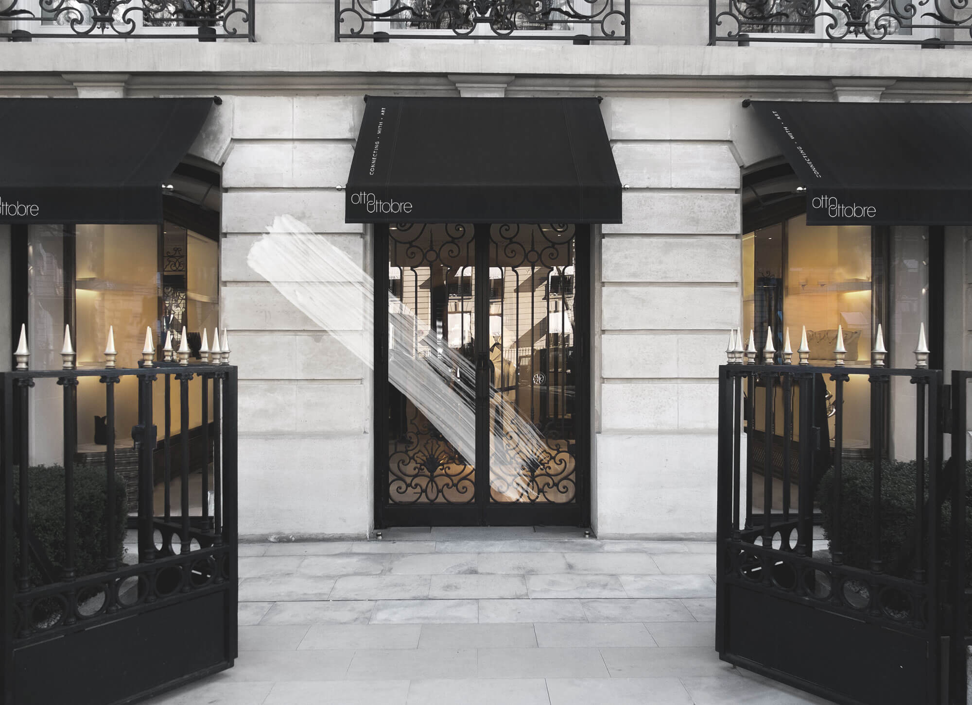
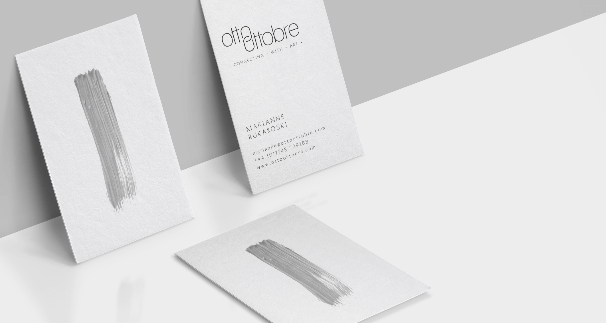
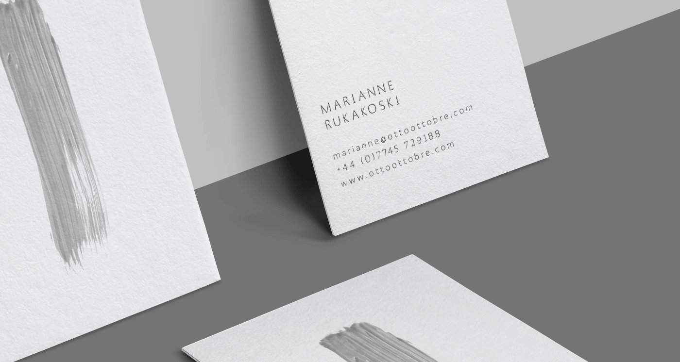
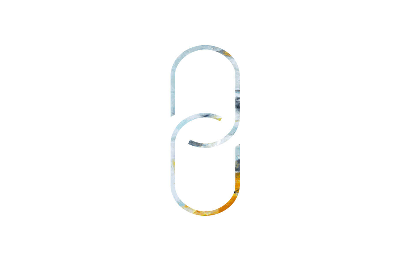
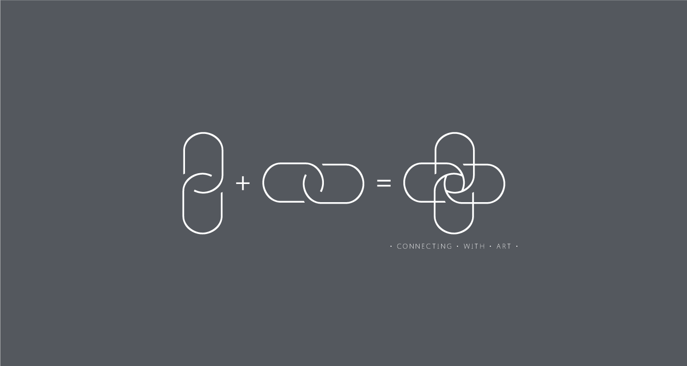
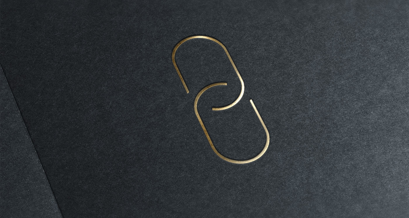
CONNECTING WITH ART
BRANDING &
VISUAL LANGUAGE
I partnered with the founders to uncover insights and translated them into a seamless graphic language. Together with a monochrome palette, the chain in the logotype reflects their ability to connect with artists.
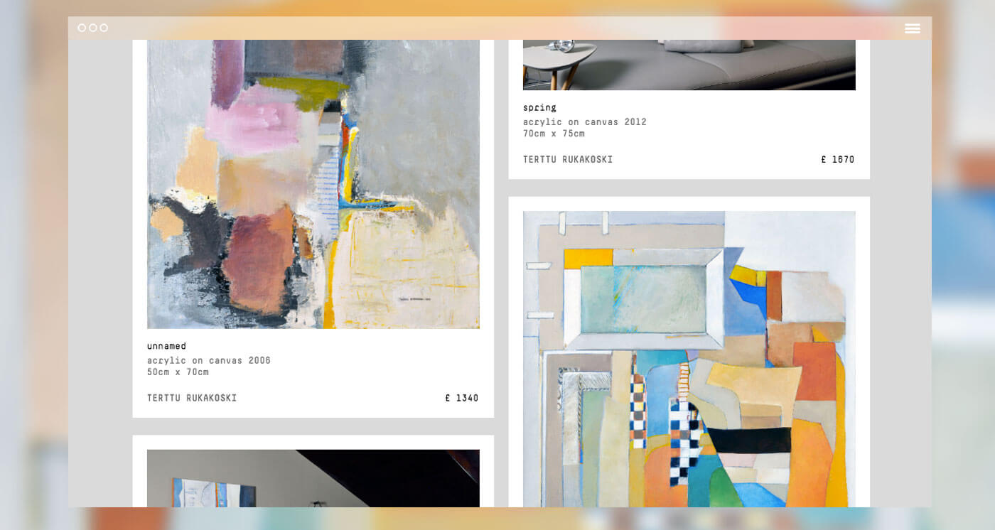
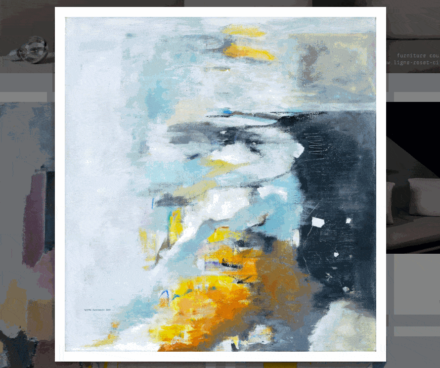
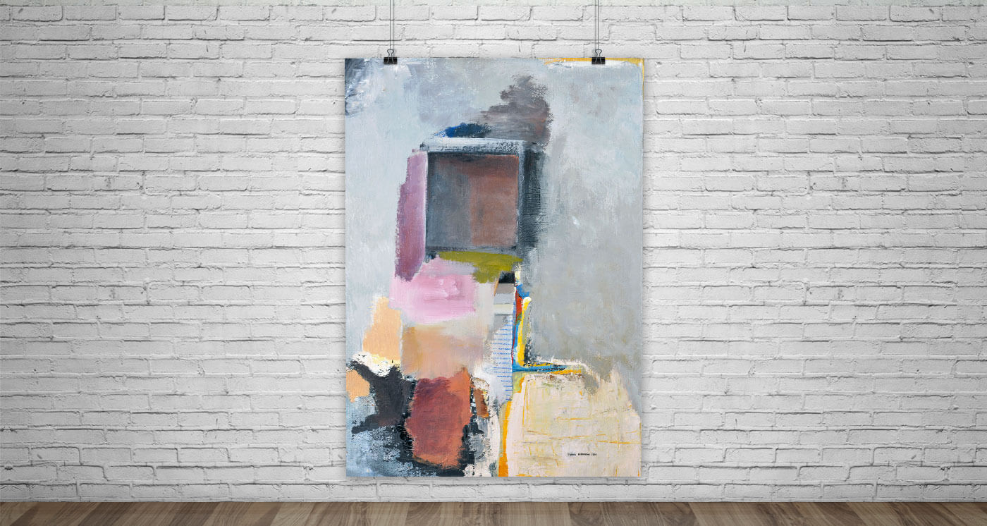
THE WEBSITE
WEB DESIGN &
DEVELOPMENT
The single-page website has been designed keeping proportions in mind and tailored to best show Terttu Rukakoski's artworks. The typewriter font choice is not casual and it gives an edgy curve to the message.